My t-shirt designs
Published:
Around February 2022, as part of the 10th anniversary of the Institute of Quantitative and Computational Biosciences (QCBio) Collaboratory at UCLA, they called for t-shirt designs to commemorate this occasion. As the name indicates, the QCBio Institute is a partnership of multiple departments at UCLA that perform quantitative and computational research in biology. The Collaboratory, is a component of this institute in charge of providing research support and workshops to researchers.
I was really excited as this was a rare opportunity to be creative. I guess as many people’s first jerk reaction I thought of sneaking the DNA double helix somewhere in the “QCBIO” letters. Using a plot that many researchers use in their data analysis was the best way to go. After brainstorming about the types of plots or graphs I have made in graduate school, I settled for a heatmap. I always found heatmaps to be very aesthetically pleasant and you can add to them many label, dendrograms, partitions, etc.
This was the first draft of my design:
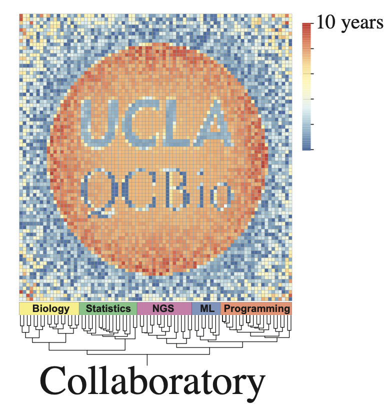
My design was selected winner, but, I was told by the Institute’s director that there were some copyright issues with the “UCLA” text. Apparently, you are not allowed to use it if the letters are not fully legible and with certain background colors.
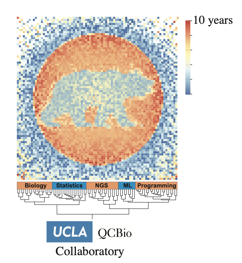
I was asked to remake it without the text. For the second version I included a “bear”-like figure in the heatmap. Additionally, I was also told to reduce the number of colors to reduce printing cost. This was the final version:
In 2024, QCBio was celebrating the 10th anniversary of its annual retreat. Once again they asked for t-shirt designs from the community.
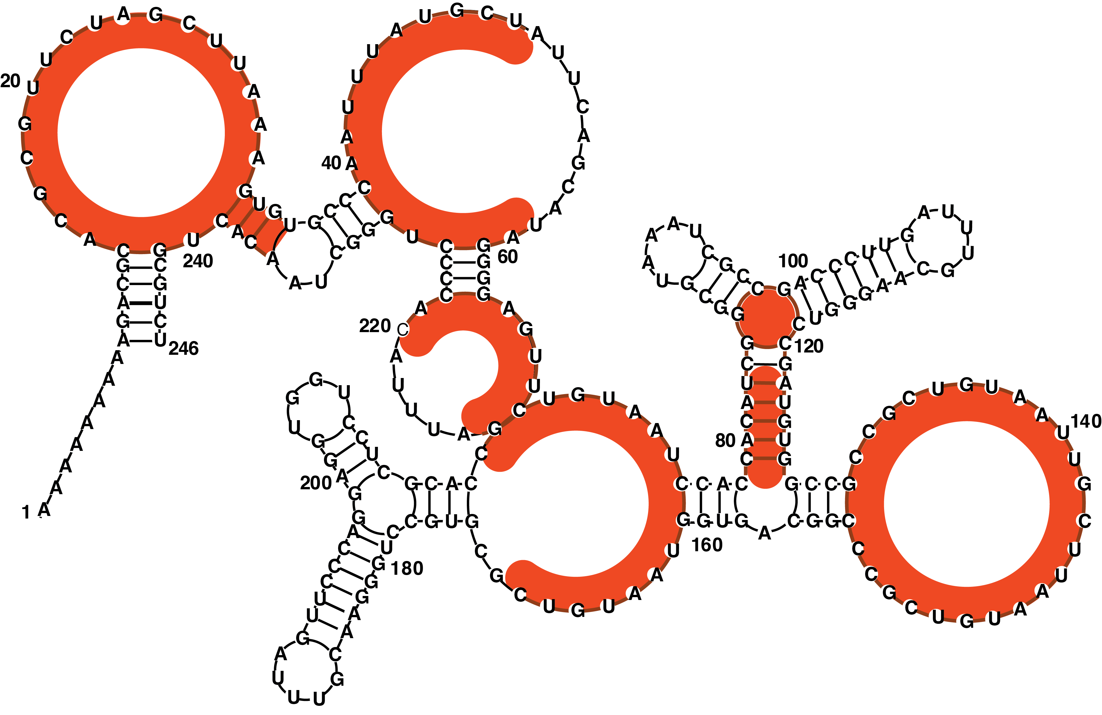
Coming from an RNA lab, I thought to use RNA’s secondary structure to spell out “QCBIO”. The idea came from the way RNA folding software represents loops or wobbles from mismatching sequences - in the form of a circle. Years ago, I also played an online game about folding RNA sequences into target structures. I learned that short stem loops and complex branching structures usually have high GC content. That makes sense as these structures present higher strain on the molecule and thus require higher bond strength.
I also added the RNA sequence to the side and “QCBio Retreat 2024” in the middle of it. It felt weird to add non A, C, G, U bases in that sequence as they could be confused with amino acids. When I added the numbers, I realized that the sequence is purely a design choice and has nothing to do with real biology.
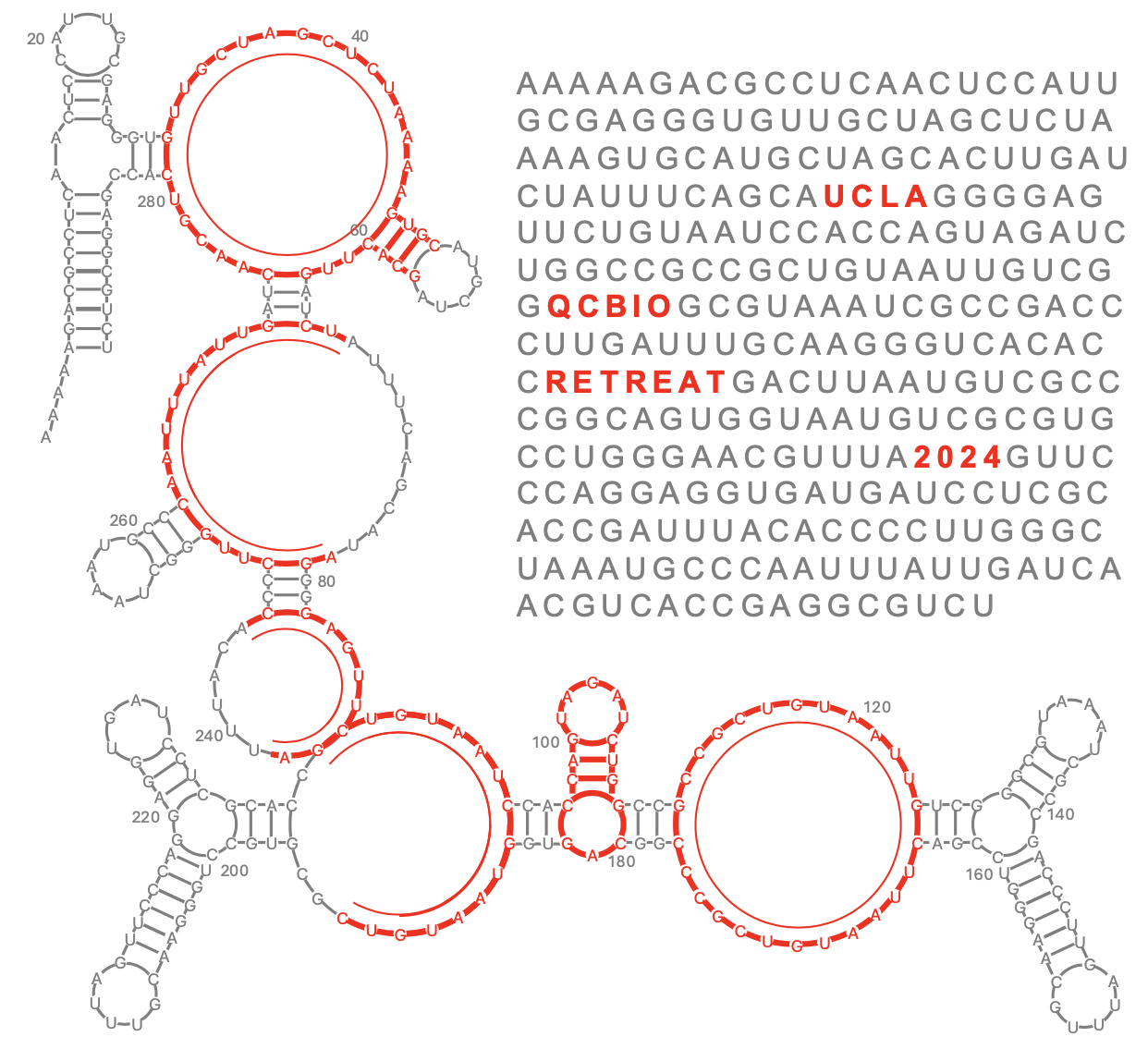
My design was selected as winner but was asked to make changes again. This time, I was asked to remove the sequence. However, in doing so, an awkward blank corner is left in the design. I had to figure out a way to rearrange the letters so that there were no big empty spaces.
The circles and semi-circles inside the structures are meant to indicate what letter is supposed to be represented. I decided to make them thicker as it wasn’t that clear in the original design. With thicker lines, I needed a lighter color as I felt the red was too intense.
I couldn’t attend the retreat during the time the t-shirt was presented but I was glad when so many people came to me to tell me the design was really cool.
